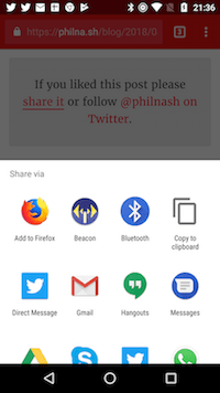
I'm a fan of the web share API but I was not happy with my initial implementation of the API. It was all a bit complex for what is a very simple API. I wanted something more declarative and easier to use with a more generic fallback for when the share API was not available.
I've been playing about with web components on and off over the last year and I wanted to see if I could make a component that would make using the web share API really easy. I think I've done it and I hope you like it.
The <web-share-wrapper>

I've built a web component called <web-share-wrapper>. It is a wrapper because it is intended to wrap around any existing elements that you might already be using as share buttons to various social networks and replace them with a single element that uses the web share API.
If you are using Chrome on Android (the only current browser that supports the web share API) then you can check out the <web-share-wrapper> in action. Either scroll to the bottom of this article and click the share link or take a look at the examples in the repo.
Using the <web-share-wrapper>
There are instructions for using the <web-share-wrapper> in the readme on GitHub but here's a quick example.
<web-share-wrapper text="Share" sharetext="Check out the web-share-wrapper web component" shareurl="https://github.com/philnash/web-share-wrapper">
<a href="https://twitter.com/intent/tweet/?text=Check%20out%20%40philnash's%20web-share-wrapper%20web%20component&url=https%3A%2F%2Fgithub.com%2Fphilnash%2Fweb-share-wrapper">Share on Twitter</a>
</web-share-wrapper>If the web share API is not available, the above HTML will just be a link to share the project via a Twitter tweet intent. If the web share API is available, then the web component will kick in and replace the link with a button that, when clicked, will invoke the web share API. The button text is supplied by the text attribute, the sharetext attribute sets the body of the share and the shareurl sets the link to share.
The button is injected into the regular DOM, not the shadow DOM, so you can style it using regular CSS.
Getting fancy with templates
If a plain button isn't your style, the <web-share-wrapper> also supports using HTML templates. Instead of using the text attribute to set the button text, use a template attribute to point to the id of a <template> on the page and the <web-share-wrapper> will hydrate that <template> and insert it in place of the content.
For example, the following code will use an <a> instead of a <button>:
<template id="link">
<a>Share link</a>
</template>
<web-share-wrapper template="link" sharetext="Check out the web-share-wrapper web component" shareurl="https://github.com/philnash/web-share-wrapper">
<a href="https://twitter.com/intent/tweet/?text=Check%20out%20%40philnash's%20web-share-wrapper%20web%20component&url=https%3A%2F%2Fgithub.com%2Fphilnash%2Fweb-share-wrapper">Share on Twitter</a>
</web-share-wrapper>Again, you can style the contents of the template anyway you like. The examples in the repo show a fancier button with an icon.
Installing <web-share-wrapper>
The web component is published to Bower and you can install it to a project with:
bower install --save web-share-wrapperI am investigating other ways of publishing this web component as, while webcomponents.org seems to favour publishing to Bower, this doesn't seem like the best long term plan for a project. Support for npm seems like the most important next step.
What do you think?
You can now use the web share API declaratively, with just a single web component. I'd love to know your thoughts on how this has been implemented and whether you think it's a good idea. Let me know on Twitter at @philnash or in the issues on the GitHub repo.
