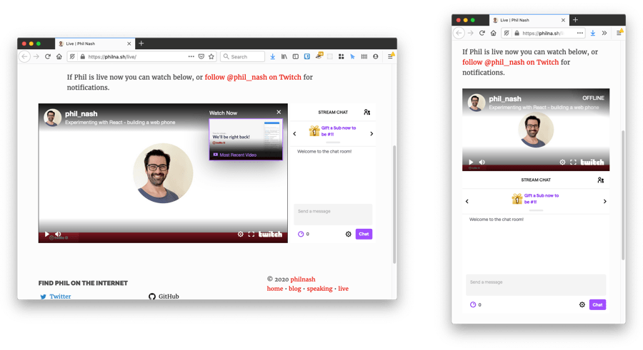
I've been trying out streaming live code on Twitch which is a lot of fun. I wanted to share on my own site that I was streaming so I have built a page dedicated to it. The page will evolve, but one of the first things I wanted to include on it was an embed of my Twitch stream and chat.
Twitch makes it easy to embed your stream but the less obvious part is how to make that embed responsive across any browser size. So here's how to create a responsive Twitch embedded stream.
The HTML
There are 3 ways you can embed Twitch on your site, embedding everything, which involves loading the Twitch Embed JavaScript that creates an <iframe> on the page, embedding just chat and embedding just video, both of which use simple <iframe>s. Initially I thought I wanted to embed everything, but the video and chat within the <iframe> behaved weirdly and I didn't have any use for the interactive JavaScript library. Instead I plumped for embedding both the video and chat <iframe>s which turned out gave me much more control over the outcome.
The HTML that I used looks like this:
<div class="twitch">
  <div class="twitch-video">
    <iframe
      src="https://player.twitch.tv/?channel=phil_nash&parent=philna.sh&autoplay=false"
      frameborder="0"
      scrolling="no"
      allowfullscreen="true"
      height="100%"
      width="100%">
    </iframe>
  </div>
  <div class="twitch-chat">
    <iframe
      frameborder="0"
      scrolling="no"
      src="https://www.twitch.tv/embed/phil_nash/chat?parent=philna.sh"
      height="100%"
      width="100%">
    </iframe>
  </div>
</div>
The layout
The video is in 16:9 aspect ratio. On mobile I want the chat to sit below the video and then when the screen becomes wide enough on the right hand side of the video. When side-by-side, the chat and video should be the same height.
The tricky part here is the aspect ratio. CSS doesn't have a native way to accomplish aspect ratios yet. For now the way to force an aspect ratio in an element is unintuitive, but at least it works. You can apply this to any HTML you need to maintain a height that is relative to its width, things like <video> elements, or <iframe> embeds like YouTube or Twitch, as in this case.
Aspect ratios with CSS
The trick is to abuse how padding works on block elements. When you use percentage based top or bottom padding, that percentage is based on the width of the element. If we set the height of an element to 0, the width to 100% and the top padding to 75% then the element achieves an aspect ratio of 4:3. Change the padding to 56.25% and you have a 16:9 ratio.
I told you it was unintuitive. But it works.
You might have noticed that if we are just padding the top of the element then there is no actual space for the content. We solve this with absolute positioning, placing the <iframe> back at the top of the element and giving it a height and width of 100% to fill out the space.
With the above HTML, the following CSS lays out the <iframe> with a 16:9 aspect ratio:
.twitch .twitch-video {
  padding-top: 56.25%;
  position: relative;
  height: 0;
}

.twitch .twitch-video iframe {
  position: absolute;
  width: 100%;
  height: 100%;
  top: 0;
}
To complete the basic layout the chat <iframe> appears below the video and behaves as a regular block level element. I set a height to give the chat enough vertical space:
.twitch .twitch-chat {
  height: 400px;
}

.twitch .twitch-chat iframe {
  width: 100%;
  height: 100%;
}
To create the side-by-side layout at wide screen sizes we need to alter this a bit. The video will take up 75% of the width of the container and the chat 25%. This is adjusted within a media query to only take effect above a certain width, for my site this became 850px.
When making the width of the video container 75%, you have to adjust the padding with the same ratio. To maintain the 16:9 aspect ratio the top padding becomes 42.1875%.
To keep the chat window the same height as the video, a little more absolute positioning is put into effect. The wrapper of both children is positioned relatively, then the chat <div> is set to 25% width and placed absolutely on the right side of the wrapper:
@media screen and (min-width: 850px) {
  .twitch {
    position: relative;
  }

  .twitch .twitch-video {
    width: 75%;
    padding-top: 42.1875%;
  }

  .twitch .twitch-chat {
    width: 25%;
    height: auto;
    position: absolute;
    top: 0;
    right: 0;
    bottom: 0;
  }
}
The result
With the above HTML and CSS, the output ends up looking like this:

Correct aspect ratios and responsive layout; mission accomplished. Check it out live here.
If you want to use this on your own site, feel free to take this HTML and CSS. Just remember to replace the channel name in the embed src. You can also learn more about the CSS aspect ratio trick and other ways to accomplish the effect at CSS Tricks.
And of course, please join me on Twitch where I will be chatting development, live coding a variety of projects, and generally having fun.
